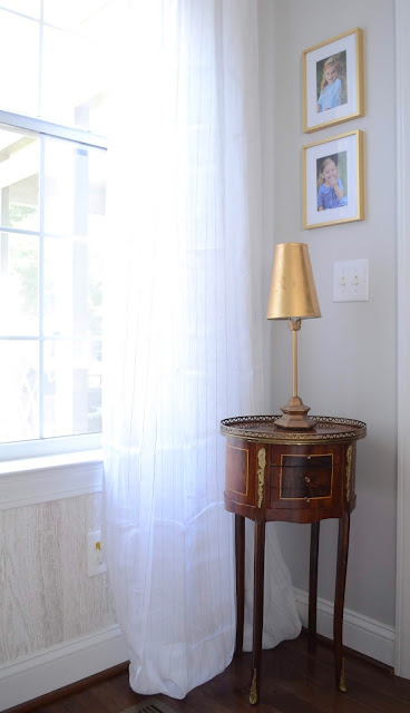
Welcome to our summery living room, now that it's almost fall. Better late than never! A lot of this has changed already because that's what I do - but here's a look at our living space as it was with summer decor.
Our house is open floor plan and doesn't really have a true "foyer", even so I like to carve out a little special place at the entry way on any project that is inviting and includes a place to drop keys and purses if need be.
I recently finished off our black ceiling fan in gray and gold to tie into the rest of the decor. I'll find some time to post on that later. We've also changed up the fireplace and added brick to the heart and surround. It made a huge difference! More on that later.
I like to use 18th century wherever I can in a space. Especially if I'm doing a "farmhouse" look with a lot of neutrals and rustic elements, an 18th century piece or some sort of antique with curves lends to the "pretty" in a room among all the rustic, textural elements. It also keeps a space from going too flat. I think a nod to traditional is always a good idea. Even in a modern surrounding, a piece like that can keep the look from feeling too "sterile" and makes it feel more collected.
I've sold this rug, so that's changed. I've put away the yellow rainbow tassel pillows for fall, and I've updated our lamp shades. More on that later!
The Thibaut Eastwood wallpaper is my favorite element in this room.
So there you have it! The living room this summer.
Fall look... to be continued...


