Is it Monday already? I'm laid up in bed today with one killer sore throat and cough. Isn't life fun? Between the cold meds, cough drops, hot liquids and cursing my very existence today, I thought I'd recap better days. Like Saturday and my trip with my friend Flower to the Atlanta Inspiration House by Cathedral Antiques. It was everything I hoped it would be and more. Quick note- it was really hard to take pictures because we were constantly moving along from room to room and the place was sort of crowded. Picture taking became super awkward, but I managed to get a few. Unfortunately I didn't get pictures of every room, like the Men's Bathroom (no, that's not a joke, there was a Men's Room on the tour, and it was gorgeous). Ok, before I hack all over my computer (is that TMI?) I had better get on with the good stuff for you...
A living room and kitchen area by Bryan Alan Kirkland Designs. Are you dying yet? Bright colors are not even my style, but this room was doing it for me. I didn't know where to rest my eyes due to all the awesome happening. And check out the great artwork... yum!
A small narrow hallway designed by Dayka Robinson Designs. This space was anything but boring and forgotten. The hot yellowy chartreuse was the perfect pop of color and contrast to that awesome black and white carpet. Somehow it all worked together in this narrow little space. Definitely not your boring beige hallway!
Dining room by Wesley Huffard, a favorite of mine in the house. What's not to love about a huge farmhouse style table, upholstered linen side chairs and wingback velvet end chairs?
This was the bar area, and I loved the artwork. The house was filled with wonderful art pieces from local artists. Really great inspiration!
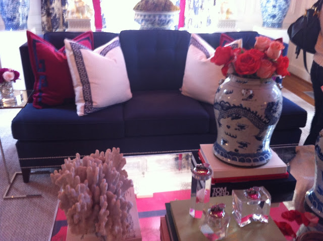
The living room by Parker Kennedy Living was, as Flower put it, "a very happy room". I noticed a trend in the house- note to self- paint those ceilings! If you like glam, you would have loved this space. Hot pink and royal blue galore.
The boardroom by Reiner/White Design Studio. Navy and peacock blue to absolute perfection. I didn't really want to leave this room.
I loved the white dogs against all that blue. The shades in the back of the room were striped and to die for.
See how the stripes on the ceiling run down into the striped shades? Love this!
A peacock blue couch, drooling at this point.
And then we walked into the bar/kitchenette area of the boardroom. OH MY GOSH. LOOK at that stone wall. They covered an entire wall in 12x12 stacked limestone tiles. How beautiful is it with the light shining down? This was my favorite feature in the entire house.
And check out this back wall. The designer used upholstery tacks and glue to create this look. How cool. I've since been trying to figure out where my house needs this look.
Two of my favorite local designers whipped up this beautiful stone room on the bottom floor. It was so cozy and sophisticated, I pictured myself curling up on this fabulous couch with a glass of white wine and a good book. And probably a big piece of cheesecake. A room this good has to come with cheesecake, right? No?
Sherry Hart and Lori May outdid themselves.
Don't you love the rustic manly stone with the feminine furniture shapes and floral patterns? I really liked the combination of the two. A perfect blend of manly and feminine, enough to make me want to eat it. I didn't though, no worries. I really appreciate designs that can accommodate a wife and a picky husband (ehem, mine).
Hallway nook by Rhonda Peterson & Associates. I loved the fabric on this chair and the metallic looking walls. Yum! Flower almost ran out with that side table, but we didn't really want to be chased down by Atlanta PD.
The parlor room by Y McFadden LLC.
This rug was like a billion (okay more like 200) years old from (I think) Pakistan. It is made of velvet and silk, and only cost $65,000. We were careful to not really walk on it. Ha!
Are you inspired yet?


.JPG)

