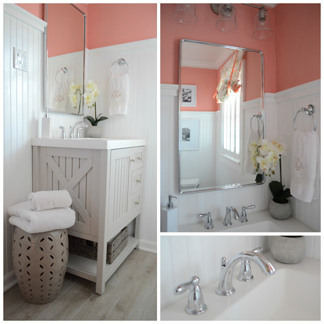
Today I thought I'd share sources from our hall bathroom redo. Disclaimer- we were on a pretty tight budget, so you won't find marble or super expensive finishes here. Plus, it's a kids/guest bathroom and I had to keep in mind durability. However! This would have been a great bathroom to splurge on because it is small and would not cost too incredibly much to use higher end tile/lighting/etc. So if you are considering a bath remodel, take the size into account.
I'm a firm believer that budget doesn't have to hinder design. You don't have to spend a ton of money to achieve a finished and classic look.
First off, the beadboard and paint. Our ceilings are 8 ft, and this bathroom is small, so I wanted some element in this space that would draw the eye up, creating the illusion of higher ceilings and a larger more interesting space. There are a number of ways you can do this, most of them involve SCALE and COLOR. Here, I opted to have my dad install tall beadboard (66"). This way your eyes are drawn up and around the room following the horizon line it creates.
The other thing you can do is COLOR. In smaller bathrooms and powder rooms (and foyers!) it's always a fun idea to do a bold color or even a graphic wallpaper. Since my husband is not on the wallpaper train (I'm still working on him), bold color was the way to go. I threw a sample on the wall and he nearly fainted at how bright it was. HA! This was before any of the beadboard had been painted and before the vanity, etc was in place. I promised him once everything was in the room the color would tone down tremendously. He wasn't so sure, but since it's only paint...
I knew the bright color could be balanced out by all the neutral in the space. It's only 2.5 feet of color, so we aren't talking painting an entire bedroom in the color (although I'd totally do it in the right room...).
I loved Benjamin Moore's Coral Gables, and found a similar color in Glidden Fresh Salmon. Since we had Home Depot gift cards, I went with the Glidden option.
The beadboard is painted Behr Ultra Pure White.
The roman shade I made from leftover nursery fabric. It's Tempo Indoor/Outdoor Birds in Natural.
The boat paddles are some of my husband's old ones. He was going to throw them away, but I saved them. He was shocked that old reclaimed paddles like these go for $200 plus when you "buy them new". The towel hooks are from the Delta Silverton Collection at Home Depot.
Flooring I went back and forth on. I wasn't sure if I wanted to do long wood plank looking tiles or do some sort of smaller mosaic. I went with the long planks to emphasize the long narrow shape of the room. Hopefully it makes a natural path for your eye from the door out to the window. These tiles are a porcelain product from Floor & Decor called Tabula Fog Wood Plank. The grout color is Bostik Misty Gray.
The vanity is Martha Stewart's 30 in. Sharkey Gray Vanity from Home Depot. I wanted something that was coastal looking and neutral. Plus, I liked that it had several drawers and a cabinet for storage and a lower shelf for toilet paper storage. The basket on the shelf is from HomeGoods, as is the garden stool.
For the mirror, we needed a medicine cabinet for the storage it would allow. Our old medicine cabinet was too small, and I wanted something tall to bounce off as much light as possible. That's key in a small space. This one is Pottery Barn's Vintage Medicine Cabinet in chrome. The light fixture is Allen + Roth Winsbrell 3 light from Lowe's. The light is in a brushed nickel finish. Don't be afraid to mix your finishes throughout your room. This will allow for a collected look rather than matchy-matchy. Matchy-matchy is your enemy in design.
Faucet is Moen Brantford collection, towel holder is Delta Silverton collection. All polished chrome.
I framed two pictures of Bluff Drive on Isle of Hope that I took on one of our strolls. The frames are HomeGoods. I went with black & white so that they wouldn't compete with the coral. Here again, playing with SCALE. By using large frames and oversized mats, these pictures don't look "lost" on the wall. When you choose artwork for a room, be sure that it's bulky enough to ground whatever is under it (in this case a toilet). If I had done smaller pictures in small frames, they would have easily looked lost and dinky.
I knew from the beginning I wanted to do tub to ceiling subway tiles in the shower. They are on trend and very affordable, which is no wonder why they are so popular. We got ours from Home Depot. They are 3x6 subways in Snow White. The grout color is again Bostik Misty Gray. Fixtures are Moen Brantford collection in polished chrome.
The bath mat I found at HomeGoods.
Orchid is also HomeGoods (aka the best place for affordable accessories).
So, there you have it. All the makings and planning into this bathroom. Can't thank my parents enough for helping us get this space done. My dad put a lot of sweat into this space for us as did my hubby. Believe it or not, I did a lot of the painting, big pregnant belly and all.
And another look at where it was...
....as long as you have vision you can change the aesthetics of any space. You just need some patience (especially if any portion is DIY) and a clear budget in mind.
Happy renovating!


