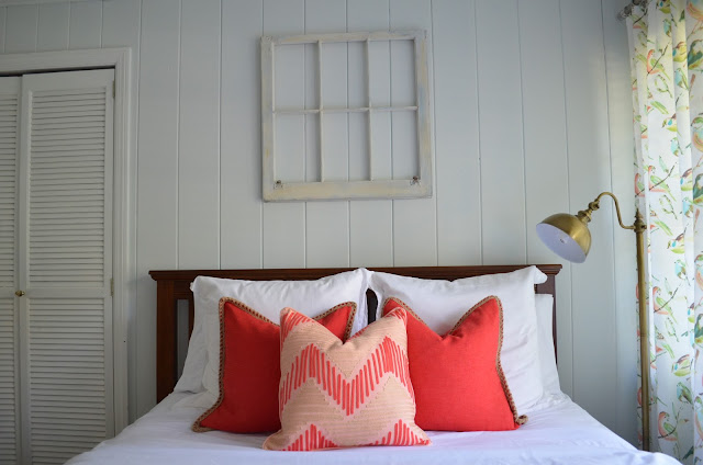
So, my plan was to use coral in this room. I wanted it to function (because it HAS to in this 3 bedroom house) as a guest room AND a nursery. So, nothing could be too baby. I usually like designing kid spaces that can grow with the child and won't need to necessarily be done again once out of the childhood phase. This is especially true for this room. I plan for my girls to share a room and allow this one to be used for guests once Mae Caroline is big enough to bunk with Evans.
I found some great inexpensive pillow options at Steinmart in the shades I wanted.
Everything in this room was coordinated around this bird fabric that I fell in love with. It is indoor/outdoor and can be wiped down with a cloth. Score. I made drapery and a crib skirt using it.
The difficult things about this room are the size and the layout. There are two doors plus closet doors leaving not much wall space for furniture, and there's also a bay window area that creates awkward angles. Although this dresser turned at an angle uses a little bit more space than having it flanked right against the wall, it also softens that corner's hard angles and allows for TV watching from the bed. Oh, that big black box that's so ugly when design is in mind. But, it's a necessary evil isn't it?
Confession, this TV isn't even pugged in and never gets used.
I mentioned a few weeks ago I bought Hubs an old transom window from The Citadel. It may or may not stay above the bed.
This lamp needs a redo for this room. I'll probably end up doing something fun with the shade and changing the color of the lamp base. I'd also like to find a smaller round table to use rather than his rectangular side table. All these straight lines give me slight hives (the headboard, the wall paneling, the many doors, the crib, the windows). The space needs a little more softening, and a round table will do just that.
This lumbar pillow is made using remnants of Quadrille fabric I got from work. Yes, I'm probably crazy to use Quadrille in a nursery, but it's not like the baby will sleep with that pillow. It was too pretty to pass up. I have problems.
I've just got the crib skirt fabric resting under the mattress and still need to finish that.
The trick to using bright colors or bold pattern is to pair them with neutrals throughout your space. By having very light walls and white bedding, the neutrals in this room give visual relief from the bright coral pillows and colorful curtains. You want your eye to be able to rest somewhere in every room. By streamlining your design choices through accessories, color, and pattern, you'll gain a cohesive look. Here, the bold pillows and drapery carry the room, allowing for very minimal wall decor. Design tip of the day :)
There's still a few things to be finished in here. The lamp, the side table, over the bed could possibly be changed (or at least the transom window frame lowered a bit)..... But overall, it's done! Now to wash all these baby clothes and put them away.... That may have to wait another month. I've got time, right?


